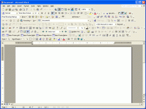
For this week’s bad user experience I used a screen shot of Microsoft word. Like my previous Bad user experience in week 4, this screen shot is a good example of too many things going on. There are way too many options on the tab. Most people don’t know what any of those button do or will never use them, so it is completely unnecessary to have them showing as an option on the page. It also looks very complicated so it may turn of users even though Microsoft word is probably one of the easiest softwares out there. It would make the user uncomfortable as they would think that this would be tools that you have to use in order to have your work perfect but that is not the case, you don’t need 98% of these tools.
- Comment
- Reblog
-
Subscribe
Subscribed
Already have a WordPress.com account? Log in now.
